Karrello — E-Commerce UX Redesign & Shopify Development
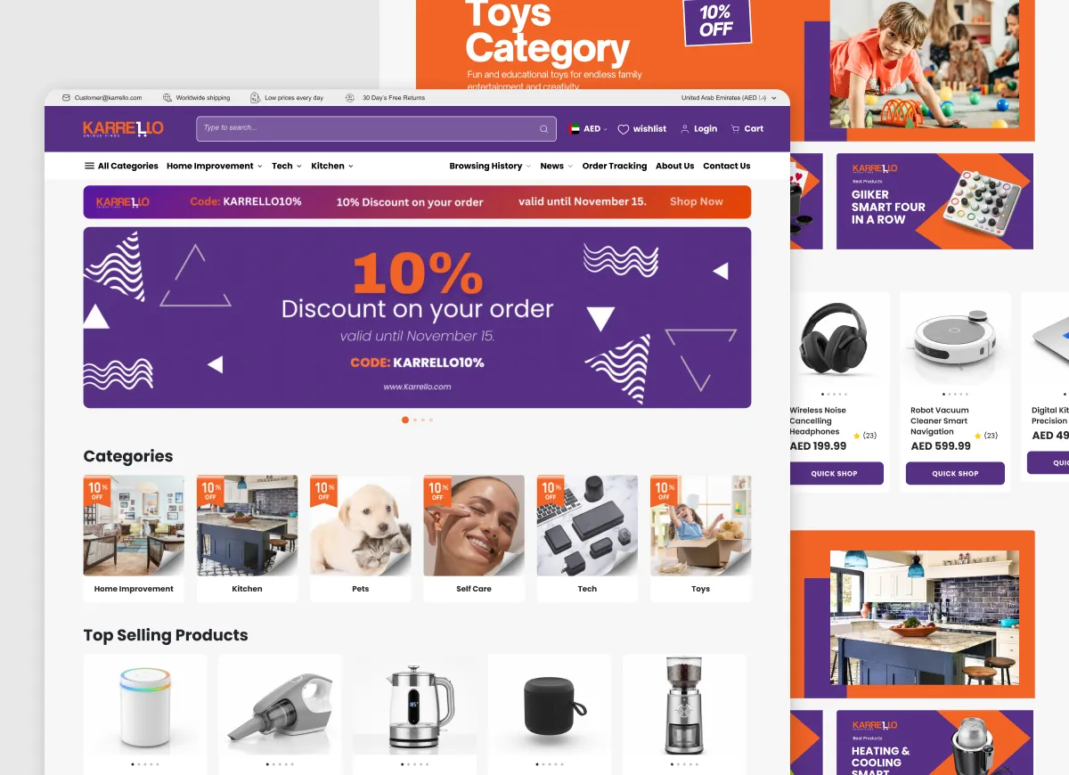
Overview
Timeline
Context
The Challenge
The store’s legacy structure presented major operational and user bottlenecks:
- Over-reliance on Page Builders: The previous reliance on heavy page-builders bloated the site code, degraded loading speeds, and created rigid layouts that harmed the mobile shopping experience.
- Problematic Product Page: The core conversion point featured oversized typography that broke visual hierarchy, hidden VAT pricing, misleading “visitor counters” that eroded trust, and massive, unstructured walls of text.
- Inconsistent Journey: Scattered navigation, weak CTAs, and a cluttered checkout and selection path caused high bounce rates and abandoned carts.
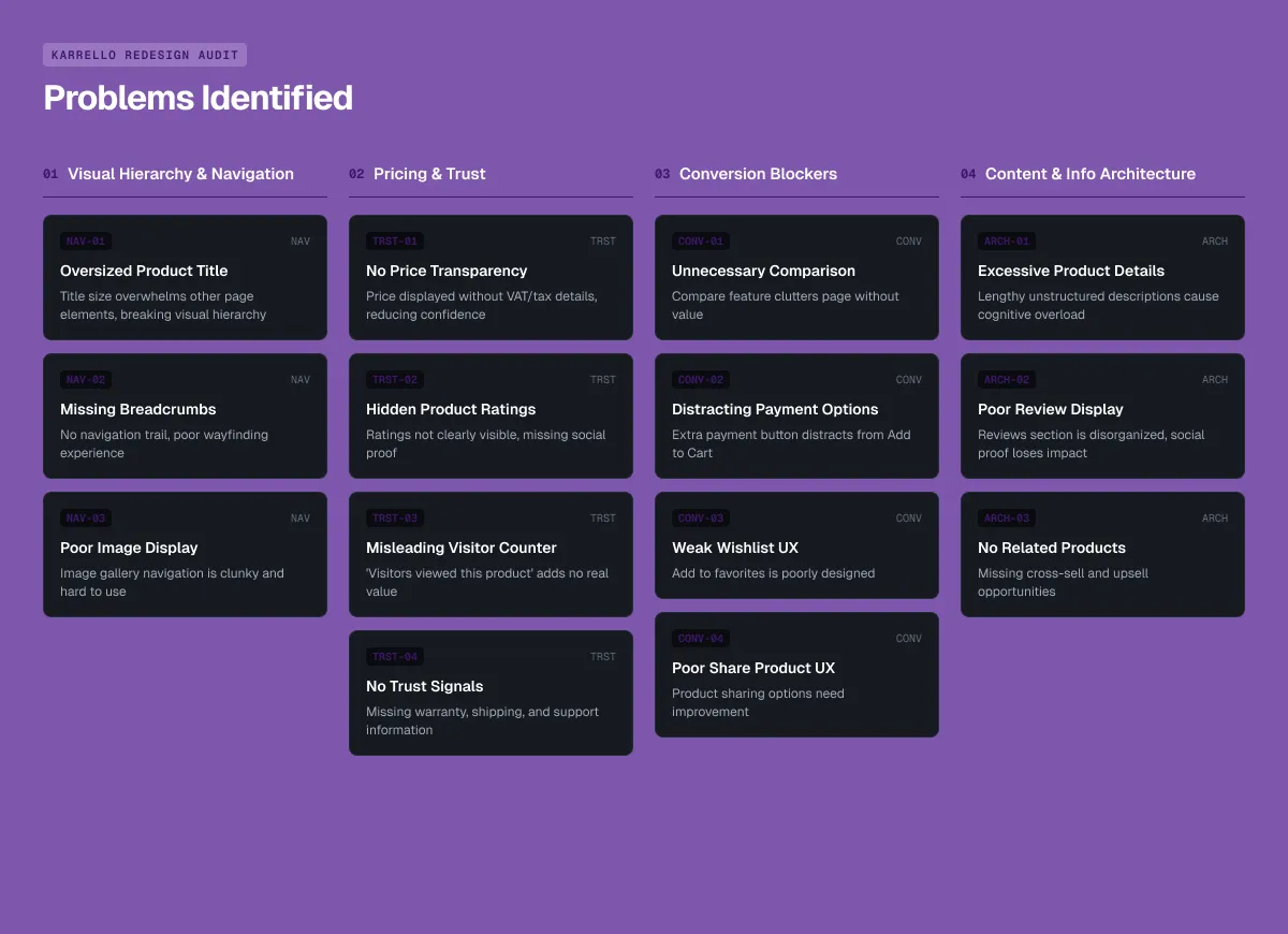
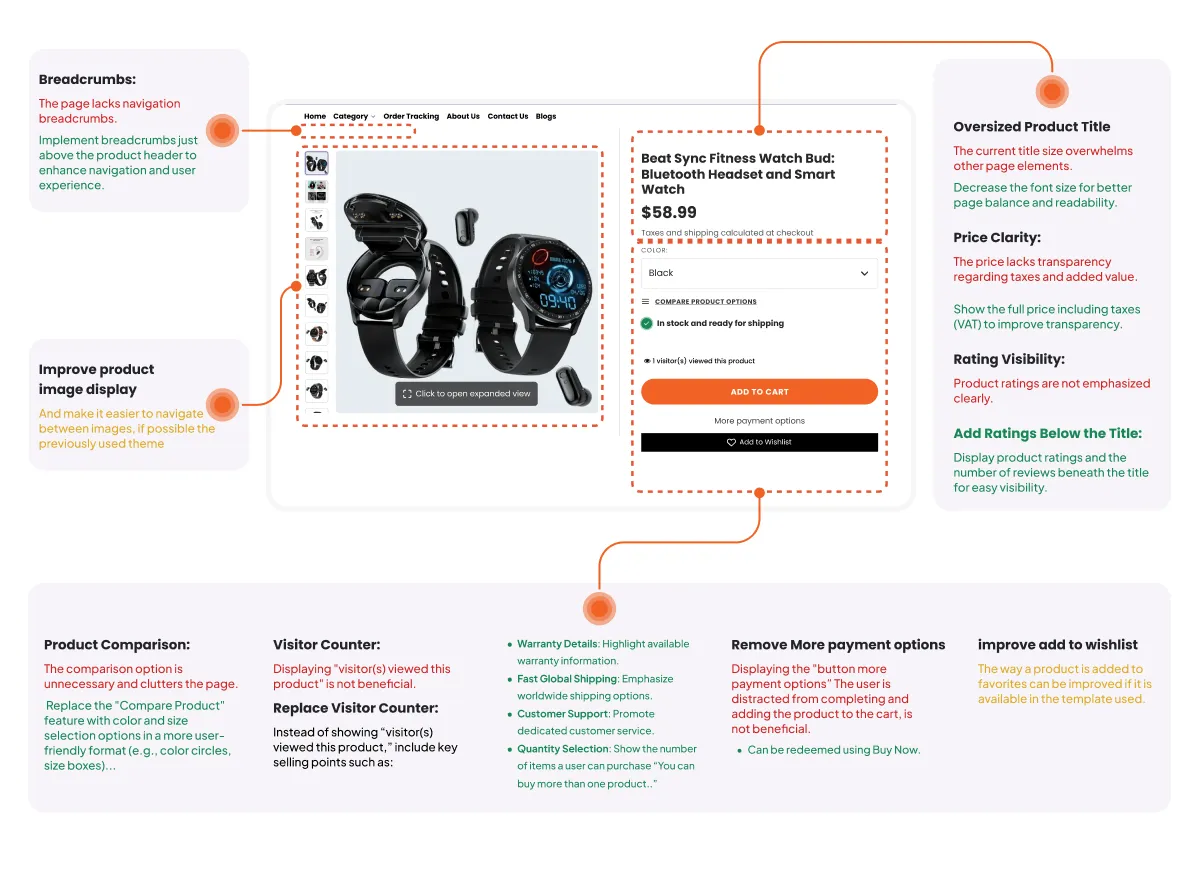
UX Audit & Problem-Solution Matrix
- Streamlined Selection & CTAs:
- Problem: Unnecessary “Compare Product” clutter and distracting alternative payment buttons splitting user attention.
- Solution: Replaced comparison features with intuitive color circles and size boxes, while consolidating CTAs into a focused “Add to Cart + Buy Now” dual path.
- Information Architecture & Reviews:
- Problem: Lengthy, unreadable product descriptions and disorganized reviews.
- Solution: Restructured product content into clean, accessible tabs (Description | Features | Reviews | FAQ ) and introduced a dedicated Related Products cross-selling section.
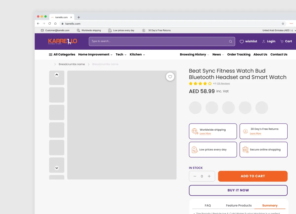
- Visual Hierarchy & Typography:
- Problem: Oversized product titles breaking visual structure and missing breadcrumbs causing user disorientation.
- Solution: Standardized typography scales and implemented clean breadcrumbs for immediate contextual navigation.
- Pricing Transparency & Trust Signals:
- Problem: Prices displayed without VAT details and fake urgency elements (visitor counters) damaging brand credibility.
- Solution: Added full price transparency with VAT included and replaced the counter with genuine trust signals (Warranty details, Fast Global Shipping, Dedicated Customer Support, and Quantity options).
Seamless User Flow: From landing on the homepage hero, browsing collections, reviewing optimized product details, selecting options without friction, down to a split, clear-cut choice between express checkout or continuing the shopping journey.
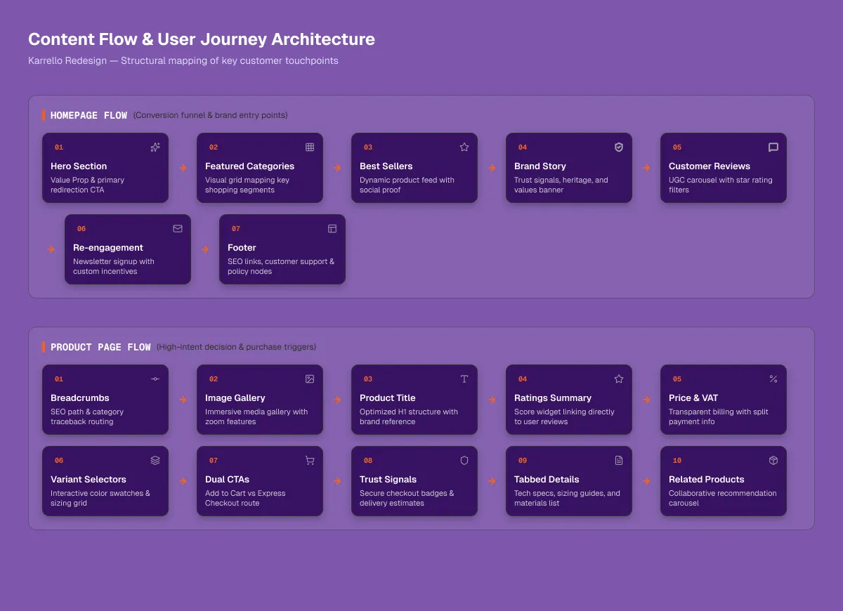
Key Design & Technical Decisions
- Trust-First Architecture: Swapped manipulative vanity metrics for authentic warranty, support, and shipping markers to secure buyer confidence at the critical decision moment.
- Pure Code & Minimalist Shopify Development: Abandoned heavy third-party page builders in favor of custom, native Shopify theme development. This drastically reduced script overhead, eliminated layout shifts, and maximized page load speed.
- Tabbed Content Hierarchy: Transformed exhausting walls of text into clean, scannable tabs to reduce cognitive load while keeping deep information readily available.
- Focused Conversion Path: Removed clutter around the call-to-action buttons, directing users smoothly through a high-intent purchase funnel.
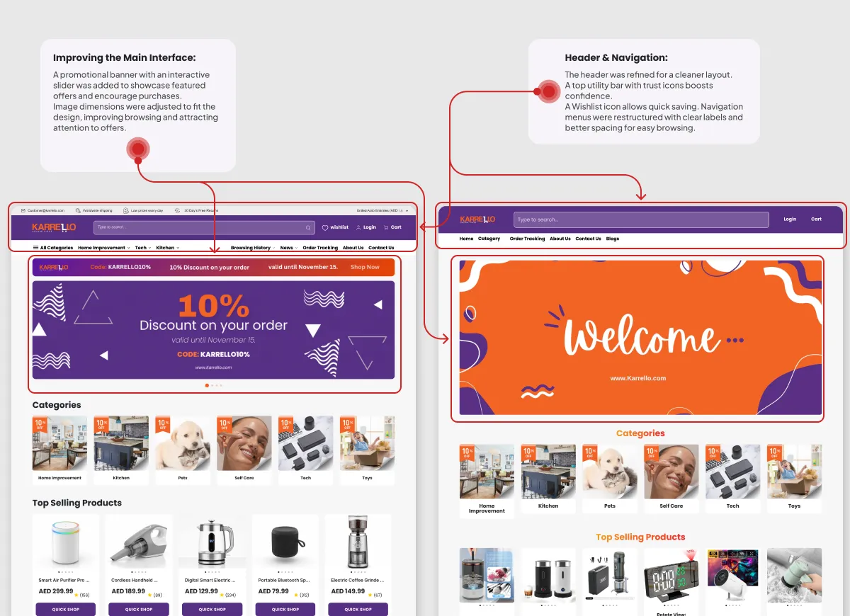
Outcome & Impact
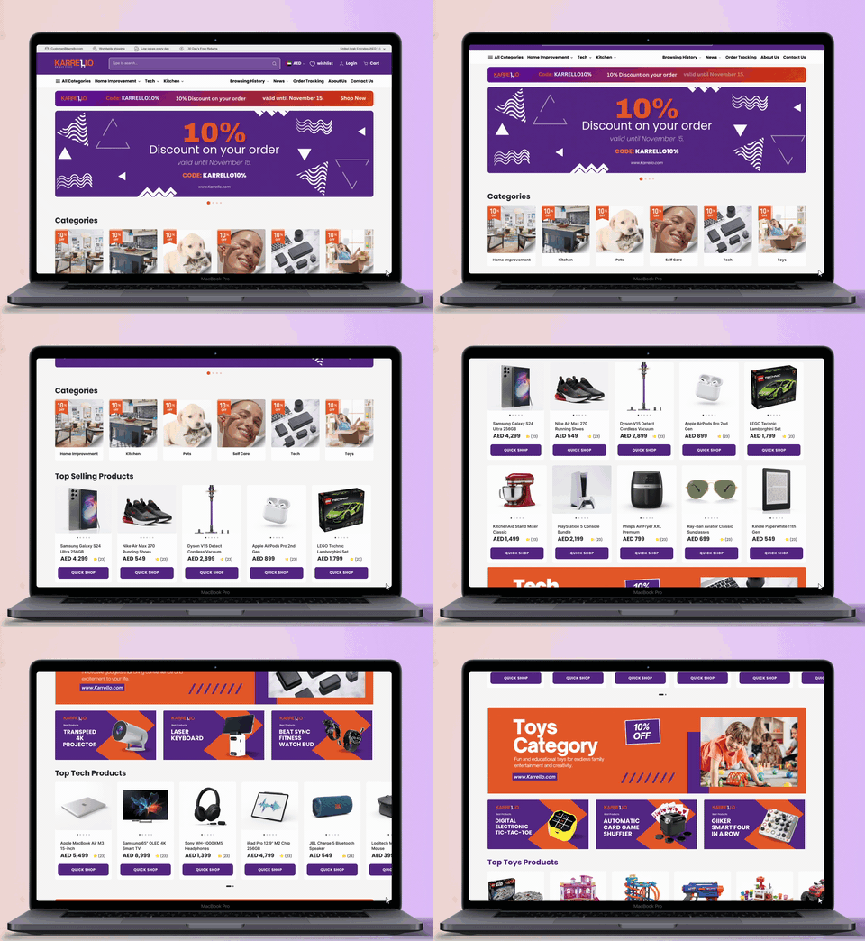
The Karrello overhaul successfully converted an underperforming, plugin-bloated store into a high-speed, trust-driven e-commerce experience. By streamlining the architecture through pure code development, prioritizing pricing and warranty transparency, and eliminating friction across the product and checkout journeys, the project established a scalable foundation designed to maximize user engagement and continuously boost sales.
Other Projects